In concept development we had to design a clock not using traditional means of numbering or telling time. I also added to my task to design with a more feminine color palette as someone in class last week mentioned that men and women tend to design in different hues, shades, and tints. Here I used some of the pinks and purples from the "be cute" posters. To further emphasize the feminine attributes I used a highly decorative, victorian in feel, border for the clock face.
To address the assignment's needs I was originally going to show the passage of time through aging or an evolutionary scale, but then I knew someone else in class would do the same thing (and they did!), so I further explored the idea of something transforming into something else. Here I used a 12 step diagram of an origami giraffe, the simple paper origin being the one spot and the final product being the twelve. To further distance this as not being a standard time piece I decided not to use hands to mark the positions on the face, and instead a projected shadow is used.
Thursday, May 5, 2011
photo-a-day 26/30
With this I was attempting to capture a view of linear lines in a single structure through a different angle that isn't usually observed by people. The point and click again took this, but didn't do as well as I would have liked, not the dark corner in the bottom right. Still this illustrates my effort...
Wednesday, May 4, 2011
photo-a-day 25/30
The last photo was taken at the peak of my noise making, where this one was taken at the decline. My aim here still was texture, but now a softer material was the subject. This was taken at the Oregon coast with a point and click camera on a very cloudy day.
Tuesday, May 3, 2011
Skool Work
We had to create a propaganda poster for image manipulation, I did three.
I sampled old Soviet posters for the color palettes for the above and below. The above image is a child from Sierre Leone, who has become a soldier. The below is a Kurdish woman who has as well followed the same path as the child.
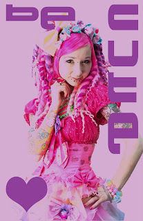
The above three's images had their thresholds adjusted to create a more graphic simple print aproach. My study partner in crime suggested I do a happier poster as the first one is depressing, and a good portion of my work for this class has been so. I discarded the color choices I made with the previous two for an obvious cuter look, but kept the demanding Sovietesque font.
I created this last one discarding all of the assignment's requisites. The image is from 6%dokidoki, a current clothing designer who has a healthy obsession with 90s rave culture. Currently one of my favorite clothing designers due to the high volume of color, an almost saturated pink palette, and thus my color choices for the last two posters.
photo-a-day 24/30
Another texture picture. At the time I took this I was making or producing at least one harshnoise album a month, and photos from this period reflect the high saturation of distorted sound I was into at the moment. I think I took this at an event I was playing, with the intent for using it as cover art, but this never happened. The aim was to show metal creating texture and reflect the mess of the sound at the time.
Monday, May 2, 2011
photo-a-day 23/30
Another subject from the same trip out to Oceanside, OR. I was attempting to make the small look big again and maybe a Zen photo at the same time. I saw the tide lines as a great opportunity for the Zen portion of this task and getting on my elbows and semi close to the subject matter for the big part. This proved a bit difficult as I was using a really bad point-and-click camera, so no digital or macro lens to help out on the focus, which seems soft here. I eventually used this photo for an nkondi album (http://www.discogs.com/Nkondi-Anotherburrowhereintherealmofceaselessmovement/release/628107) cover, the album itself dedicated to Koji Tano (aka MBSR), who passed away from stomach cancer in 2005.
Sunday, May 1, 2011
photo-a-day 22/30
To celebrate the sun coming back to Portland I thought I post a likewise shot. This was taken 6 or so summers ago. I wanted to give these thistle like weeds a stencil like feel thus placing the sun behind them and angling up from a low position.
Subscribe to:
Posts (Atom)


