Sunday, November 20, 2011

Type I Poster Design


For typography, I had to design an informational poster about a type.  I chose American Typewriter, as I felt going too weird would have distracted the viewer in general, but felt that this was way more unique and heavier than say Courier, or similar "type" fonts.
I had to make five sketches where the class gave me feedback.  My two strongest were slight variations of the above, in which I took further than their originals of course.
The first one was laid out using a grid method, save for the enormous A, which I treated as a non-grid graphic element to line up type against in a new grid.  I felt this made the appropriate juxtapose I was looking for in the overall design, albiet a bit more subtle than the second piece.
The second poster utilized grunge elements, particularly the paint splatter, non grid format, and the skewed line work.  I treated some type elements a little off kilter to further add to the overall grunge effect.  I think this played nicely against the subject typeface as it is a decently clean old style.  The juxtapose here working to make this font almost grimy.

Saturday, October 29, 2011

photo-a-day 2 20/20


Here is a little trick I thought of myself.  I wasn't too sure if it would work, but it did the first time I tried it here.  I wouldn't be surprised if someone else may have done this before, but it's all in the wrist.  The gray sky behind the buildings caused the overall composition to look black and white, when in fact it is color.  I'm glad this is was the case as I feel too much color would take away from the overall effect.

prints

Thursday, October 27, 2011

photo-a-day 2 19/20


Another cool thing about Detroit's downtown is this mixture of old and new.  I found this best illustrated here.  I took a good strong under angle to help illustrate the immensity of these structures, but also made sure I captured their interaction in the same swoop.  Luckily there was a monorail line as well to be included in the frame.

prints

Tuesday, October 25, 2011

photo-a-day 2 18/20


Detroit has some amazing architecture in the downtown area.  I find this one to be on e of the better buildings I have encountered inside and out.  It reminds me of one of those mega structures that one would find in a scifi novel.  I wanted to illustrate it's symmetry both in the structure itself and the reflections of the outer towers on the center one.  The sky was a nice cloudy one, to offer less interference and for greater concentration on the subject at hand.

prints

Sunday, October 23, 2011

photo-a-day 2 17/20


The added depth of a simplest silhouette was intended to function on a multiple levels.  Power lines always make for great movement in a photo that would be too still if it were just clouds.  They also cut up the frame random sections of smaller frames.  And there is the opposed western movement, with the power lines starting lower in the composition and splitting eye movement into two different directions of up and down.  Viewers who read from left to right tend to view art the same way.

prints

Thursday, October 20, 2011

photo-a-day 2 16/30


Risking getting hit by a car I took this today.  What compelled me to take the shot when traffic was busiest must have been the sun glint off the rails, an ooh shiny moment.  I wish I had a little more time to change the focus a hair up the frame, but for off the hip I like this plenty fine.  I was attempting a great deal of depth and I think the complex subject made it very easy.  Fresh rain on the street has always been a very appealing thing to me, and what has attracted to me to stay in the pacific northwest.

prints

Wednesday, October 19, 2011

photo-a-day 2 15/20


As much as a self portrait one would be able to get out of me utilizing this media.  Even thought that was not primary result of this, I was still aware that my image would inevitably buried amongst all the lines of both the elevator shaft and the reflection.  If I remember correctly there was a little construction going on behind me, hence the large truck.  If you step back from the detail though, it as if I created a plaid out of reflection and object.

prints

Monday, October 17, 2011

photo-a-day 2 14/20

Another example of micro worlds turned larger, through macro and close up techniques.  Again foreground objects were ignored to create a more centered and balanced focus, and add to the overall terrain view one might expect if looking off into the distance.  Nature has provided a nice almost dead palette.

prints

Sunday, October 16, 2011

photo-a-day 2 13/20


I had some technical difficulties, but here is the photo-a-day resumed.

I always found that simplicity is sometimes the best story provider.  Here a silhouette of a telephone pole stands in front of a painted sky.  This was taken at sunset, from the balcony of an old apartment of mine. Nothing here was manipulated, just luck in sky conditions and timing.  I chose to keep the telephone pole present as to give the photo more depth and to give the picture more context than something completely abstract that would be just the clouds.

prints

Thursday, October 13, 2011

photo-a-day 2 12/20


I was experimenting with the focus a bit here in hopes to exaggerate the colors of the scene.  The daisies in the back ended up being the point of focus, and not the flower in the foreground.  This I wanted to feel like a splash of paint interrupting the focus.  The odd focus also lends itself to an overall fake plastic look to the entire whole.  This was taken on a bright sunny day which furthered my goal of super saturated colors.

prints

Monday, October 10, 2011

photo-a-day 2 11/20


If you haven't noticed, I like to take photos of architecture reflecting other architecture.  Generally this is a highrise from a distance with a nice glass surface reflecting a building near it.  Here I approach a similar idea, but this time I'm closer to the reflector.  This is a glass elevator shaft with the elevator lifted above.  I angled this with a slight tilt to give it a better flow and direction.  Parts of the elevator shaft line up nicely with the buildings' verticals and horizontals giving a sense of balance and unity.  The trees cut up the forms to add an organic element adding more depth to the overall frame.

prints

photo-a-day 2 10/20


The light conditions for this ended up being exactly what I wanted.  A case of being at the right place at the right time.  The angle was low as this odd plant is more of a bush shape that only comes up to mu chest or so.  A macro setting was used to give a different focus to the whole as I wanted to un-focus the rear of the image even more to create a more abstract feel to that part of the frame.  I think the light lent itself to help the greens' vibrance not diminish in this.

prints

Saturday, October 8, 2011

photo-a-day 2 9/30


I took a couple of photos of telephone poles stripped of years of flyers.  Rusted staples and various color washed paper torn and shredded made for some modern art.  These were taken at dusk giving them a more overall blue tone.  What most people tend to ignore can become art in the right composition and framing.

prints

Wednesday, October 5, 2011

photo-a-day 2 8/20


I was going through some transitions in my personal life when I took this.  I was feeling very introspective and thus felt the light through the petals reflected my mood at the time.  The focus was chosen to give the rest of the flower a more ethereal out of focus look, something a little more somber.  Unfortunately the light was not cooperative as I feel this would have been way better at dusk or dawn.

prints

photo-a-day 2 7/20


Architecture is one of my favorite subjects, especially larger buildings.  Their glass sides lend to reflecting other large buildings adding depth and character that wouldn't be there if they had no neighbor.  This also creates more intersecting lines which I'm also very fond of.  This time around though I forwent the reflections as the uncover awning created enough intersection.  The glass windows behind this nakedness moving away at a not too extreme angle, keeping a calm almost order to the over all piece.

prints

Monday, October 3, 2011

photo-a-day 2 6/20


This low angle shot I took a couple of times to frame the "V" structure of the grate the way I wanted it, as well as getting the focus just right to have a little foreground fuzziness.  This created a greater depth giving the subject a more cavernous feel than it had in real life.  Also present is more corroded man made forms, this time taken over a little by nature, both in the cobweb and the moss.

prints

Sunday, October 2, 2011

photo-a-day 2 5/20


I always find man made materials decaying a point of interest.  This was rusted parts on an older VW Bug.  What also caught my eye was the juxtaposition between the shiny "new" metal trim and the rust so close together.  The texture of the bubbling paint is also something I enjoy and I think it adds a lot of character to what would have just been chrome on white.

prints

Saturday, October 1, 2011

photo-a-day 2 4/20


This monolith is somewhere downtown Portland, I want to say it is a parking structure but I'm not entirely sure.  The sun was perfect for this shot allowing for a great deal of contrast between the side it was throwing itself on and the shadows it helped the structure cast.  It reminds me of oppressive communist architecture, or a large thudding pound trailing off into a blue wash of silence.

prints

Friday, September 30, 2011

photo-a-day 2 3/20


Depth through simple framing of the subject and near parallel lines.  A nice bright sunny day helped darken the fence top in the foreground as not to distract too much from the other two figures.  The balance is still leaning towards the fence in depth of shadow, but the parallel lines help the eye follow the crane to the building.  There are also a couple of axis approached in the overal composition, lending to a more subtle rhythm.

prints

Wednesday, September 28, 2011

photo-a-day 2 2/20


Here my intentions were to capture rhythm, form and texture, all the while trying to make something small and insignificant look bigger.  This is brick work surrounding a window in Portland, with the bricks an average size.  The angle was particularly difficult and there was a series of shots taken until I felt I had the right one which is a rare occurrence for me.  I particularly like the pock marks and water stains these bricks have, as well as their drab color.  They remind me of some totalitarian eastern European modern sculpture.

prints

Tuesday, September 27, 2011

photo-a-day 2 1/20


This is construction of a downtown Portland building.  I beleive they are trying to remodel on an old building frame, which seems to be the thing to do around here.  As to what purpose these metal additions are to serve is beyond me at the moment, as the site is far from done.  What piqued my interest was the rhythm that they created.  They become a confusing mess and play an optical illusion on the eye as to which ones are attached horizontally, and which are attached vertically.  The lack of balance moves the focus from one side to the oher, with the white negative space (the sky was bright and cloudless) offering a reprieve from the chaotic rhythm of the structures new additions.  The building itself has considerate amount of natural rhtyhm one would expect from a downtown high rise, but this nearly lost underneath the main focus of the piece.  I've noticed this can happen when layering drums (or other instruments) in a song.  Certain frequencies of bass and mid range tones can cancel the other out if there is too much sustain/not enough decay on the guilty party.

prints

photo-a-day 2 prints

This next photo-a-day challenge will allow you to purchase limited to 5 per photo prints from me.  Each print will 11x14 inches (or the other way around depending on orientation), hand numbered and ship to your location in the US for only $45.00.  (The rest of the world will be charged a little more for shipping cost.) 

Please contact me directly if you are interested in buying a print from me:

aliceautomated@gmail.com

Sunday, June 12, 2011

Skool Werk: Concept Development

Our final project for concept development was to take out first assignment, a hero/villain calling card and turn it into a movie poster.  I came up with this series of posters:


The color choices were made from the original calling card piece, except for the red, which was added as a story element for the movie.  The spiral text was inspired by a bird's eye view of a spiral staircase and I chose to present it this way to illustrate the decent of madness that the story is about.  The gear elements are also from the original calling card piece, and go with the automated part of the title.

Underscoring feelings through imagery...

For concept development last week we were to take a photo that underscores a feeling.  I took this of two people holding hands and  left it abstract so the viewer could easily identify with the scene.  I made sure this was done in a dim lit room partially under the table, as to add warmth.  I was attempting to provoke friendship and feel that I was quite successful in this regard.
Next we had to take it down to a pure black and white image or graphic reduction without any gray scale and re-crop or reshoot if necessary, to see if it was easier to read as the original intention.  I didn't feel that either reshooting or changing the cropping I had originally done was necessary as when I presented the first image to class everyone got it.  As for the reduction losing its color and retaining the value, I do feel it has lost a little of the warmth, but the over all feeling prevails.  It reminds me of an 80's single cover, and if I were to do a duet with the other model this might be a good choice for a graphic cover.

Sunday, June 5, 2011

Skool Finals

So I jumped the gun on the promotional piece I did earlier in image manipulation, or it was just practice for the final project that the teacher is requiring us to complete for this week, a CD cover:
I wanted to reflect my style within 30 seconds, so I chose high graphic, illustrated looking pieces.  I topped it off with dirty graphics and street style typography, and a color pallet that I use very often in my personal work.  The graphic sunburst on top of the images adds a bit of movement with nice angularity, pushing in and out, and a circular motion subconsciously invoking forward thinking in the viewer.
The current final I am working on now, for concept development, involves a logo design and an ad campaign.  The add will be finished by tomorrow, and posted as soon as possible, but the logo that was due a couple of weeks back (sorry I haven't posted this til now, but I traveling and taking 300 plus photos in Detroit got in the way) is finished:
This is for a small time record store that caters to the non-corporate working class American.  I chose the iconic record symbol of a 45 adapter, used a dirty broken type to give a that working class feel as well as a wax sensation, and a bright construction work yellow to further emphasize the working class subtext that I am pushing and doubling as the color that most 45 adapters are molded in.

Tuesday, May 17, 2011

Skool and promotional piece

In photo manipulation we had explore our style and what our influences were with simple word listing and through a montage of 3-5 works from our portfolio.
I saw this as an opportunity for a quick promotional piece.  When I first laid out the images I had both of the heavy purple pieces on the bottom, which made things kind of top heavy, as the other images are a little darker in theme and imagery (obviously not color).  So I shuffled them into the configuration you see above, thus creating a cross hierarchy of color and subject matter.  Too tie in all the pieces together and hide any obvious border I superimposed the "circle 3" from my business card.  This not only tied the images together better, but turned this into the promotional piece I was looking for.
What I also like about this is that it illustrates my current transition from overly dark themes into more cuter light hearted one.  Also a partial preview of my summer campaign which will culminate hopefully into a show before fall term begins at school.

(un)Commisioned

Here is a pen and ink illustration I did for my friends. 

I like illustrating extreme angles as it presents more of a challenge to me spacial wise, but I also see the inherent challenge of making a portrait interesting enough for someone to want to stare at it longer than the average peson stares at a piece of art.  This was done in a traditional style of pen and ink, with a pencil sketch and ink laid on top of that.
Then I made a color version for their respective phones. 

I did simple coloring in photoshop leaving some of the space white as not to distract from the colored shapes that I wanted to accentuate the most, namely the hearts.  I think the background coloring helped emphasize the three dimensional pose and made the hands come forward even more.

Tuesday, May 10, 2011

photo-a-day 30/30:

I like street art, and awhile back with my point and click I took this.  I chose a dead on shot as the door's molding framed the piece well enough and the message below would have been lost if I meessed around too much with the angles or anything else.  The best part of this photo is eventually I met the artist through a mutual love of musics.

Monday, May 9, 2011

photo-a-day 29/30

On my elbows with the point and click at Oceanside in Oregon, again I was attempting a new landscape by getting in close and changing the average perspective.  I chose to focus on the rocks further away from the foreground, which took a bit of tricking the autofocus on the camera itself.  I got it right much to my disbelief that I could pull it off with the tools I had.

Sunday, May 8, 2011

photo-a-day 28/30

One of the best things I've found about cherrie blossoms is the bright pinks that they tend to be work really well with the browns and greens of their trees.  The detail of this came through nicely with the macro setting of my digital camera, also given that the day was a little gloomy and windy.  These specimens in particular were not the most pretty I've come across, but my main focus in this was the interaction of color.

photo-a-day 27/30

Line, form and intersection was my main aim here.  The glass distorting the buildings and the buildings reflected in the surface on the left add a new perspective to the structures.  I also was attempting for a high contrast between the lighter structures and even light blue sky in the back and the foreground's shadowed pieces.  I accomplished this again by having the sun high and bright and shooting from a low angle in relation to the subject.

Thursday, May 5, 2011

skool work

In concept development we had to design a clock not using traditional means of numbering or telling time.  I also added to my task to design with a more feminine color palette as someone in class last week mentioned that men and women tend to design in different hues, shades, and tints.  Here I used some of the pinks and purples from the "be cute" posters.  To further emphasize the feminine attributes I used a highly decorative, victorian in feel, border for the clock face.
To address the assignment's needs I was originally going to show the passage of time through aging or an evolutionary scale, but then I knew someone else in class would do the same thing (and they did!), so I further explored the idea of something transforming into something else.  Here I used a 12 step diagram of an origami giraffe, the simple paper origin being the one spot and the final product being the twelve.  To further distance this as not being a standard time piece I decided not to use hands to mark the positions on the face, and instead a projected shadow is used.

photo-a-day 26/30

With this I was attempting to capture a view of linear lines in a single structure through a different angle that isn't usually observed by people.  The point and click again took this, but didn't do as well as I would have liked, not the dark corner in the bottom right.  Still this illustrates my effort...

Wednesday, May 4, 2011

photo-a-day 25/30

The last photo was taken at the peak of my noise making, where this one was taken at the decline.  My aim here still was texture, but now a softer material was the subject.  This was taken at the Oregon coast with a point and click camera on a very cloudy day.

Tuesday, May 3, 2011

Skool Work

We had to create a propaganda poster for image manipulation, I did three.
 I sampled old Soviet posters for the color palettes for the above and below.  The above image is a child from Sierre Leone, who has become a soldier.  The below is a Kurdish woman who has as well followed the same path as the child.

 The above three's images had their thresholds adjusted to create a more graphic simple print aproach.  My study partner in crime suggested I do a happier poster as the first one is depressing, and a good portion of my work for this class has been so.  I discarded the color choices I made with the previous two for an obvious cuter look, but kept the demanding Sovietesque font.

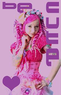
I created this last one discarding all of the assignment's requisites.  The image is from 6%dokidoki, a current clothing designer who has a healthy obsession with 90s rave culture.  Currently one of my favorite clothing designers due to the high volume of color, an almost saturated pink palette, and thus my color choices for the last two posters.


photo-a-day 24/30

Another texture picture.  At the time I took this I was making or producing at least one harshnoise album a month, and photos from this period reflect the high saturation of distorted sound I was into at the moment.  I think I took this at an event I was playing, with the intent for using it as cover art, but this never happened.  The aim was to show metal creating texture and reflect the mess of the sound at the time.

Monday, May 2, 2011

photo-a-day 23/30

Another subject from the same trip out to Oceanside, OR.  I was attempting to make the small look big again and maybe a Zen photo at the same time.  I saw the tide lines as a great opportunity for the Zen portion of this task and getting on my elbows and semi close to the subject matter for the big part.  This proved a bit difficult as I was using a really bad point-and-click camera, so no digital or macro lens to help out on the focus, which seems soft here.  I eventually used this photo for an nkondi album (http://www.discogs.com/Nkondi-Anotherburrowhereintherealmofceaselessmovement/release/628107) cover, the album itself dedicated to Koji Tano (aka MBSR), who passed away from stomach cancer in 2005.