The color choices were made from the original calling card piece, except for the red, which was added as a story element for the movie. The spiral text was inspired by a bird's eye view of a spiral staircase and I chose to present it this way to illustrate the decent of madness that the story is about. The gear elements are also from the original calling card piece, and go with the automated part of the title.
Sunday, June 12, 2011
Skool Werk: Concept Development
Our final project for concept development was to take out first assignment, a hero/villain calling card and turn it into a movie poster. I came up with this series of posters:
Underscoring feelings through imagery...
For concept development last week we were to take a photo that underscores a feeling. I took this of two people holding hands and left it abstract so the viewer could easily identify with the scene. I made sure this was done in a dim lit room partially under the table, as to add warmth. I was attempting to provoke friendship and feel that I was quite successful in this regard.
Next we had to take it down to a pure black and white image or graphic reduction without any gray scale and re-crop or reshoot if necessary, to see if it was easier to read as the original intention. I didn't feel that either reshooting or changing the cropping I had originally done was necessary as when I presented the first image to class everyone got it. As for the reduction losing its color and retaining the value, I do feel it has lost a little of the warmth, but the over all feeling prevails. It reminds me of an 80's single cover, and if I were to do a duet with the other model this might be a good choice for a graphic cover.
Sunday, June 5, 2011
Skool Finals
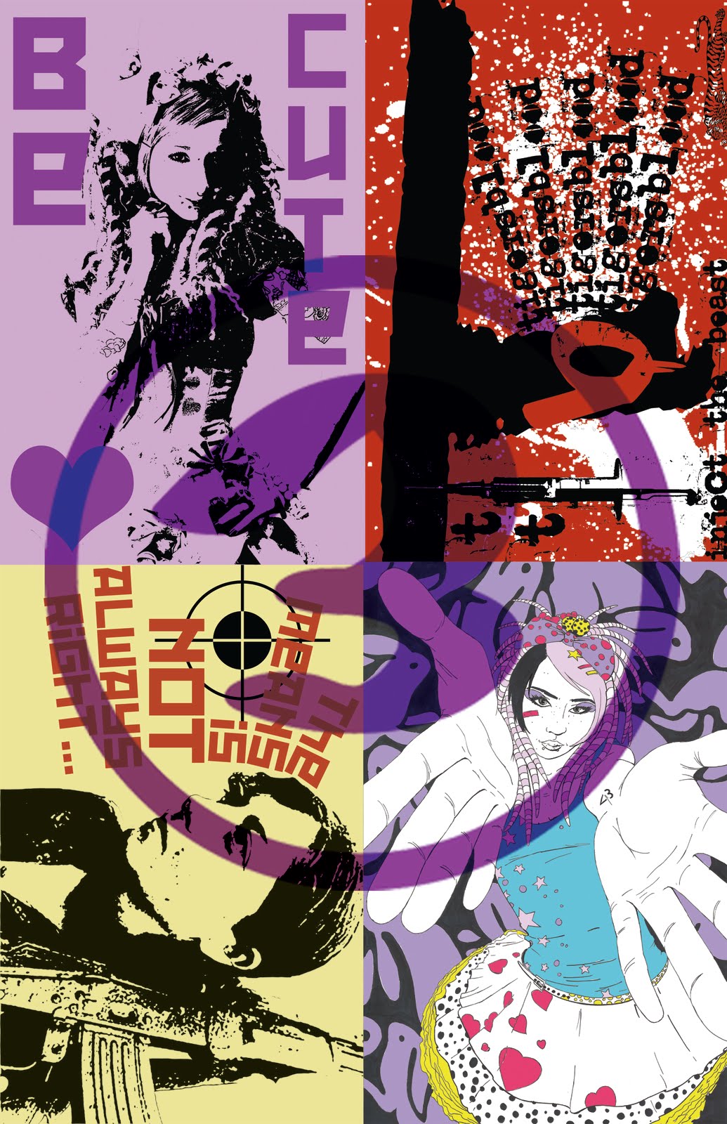
So I jumped the gun on the promotional piece I did earlier in image manipulation, or it was just practice for the final project that the teacher is requiring us to complete for this week, a CD cover:
I wanted to reflect my style within 30 seconds, so I chose high graphic, illustrated looking pieces. I topped it off with dirty graphics and street style typography, and a color pallet that I use very often in my personal work. The graphic sunburst on top of the images adds a bit of movement with nice angularity, pushing in and out, and a circular motion subconsciously invoking forward thinking in the viewer.
The current final I am working on now, for concept development, involves a logo design and an ad campaign. The add will be finished by tomorrow, and posted as soon as possible, but the logo that was due a couple of weeks back (sorry I haven't posted this til now, but I traveling and taking 300 plus photos in Detroit got in the way) is finished:
This is for a small time record store that caters to the non-corporate working class American. I chose the iconic record symbol of a 45 adapter, used a dirty broken type to give a that working class feel as well as a wax sensation, and a bright construction work yellow to further emphasize the working class subtext that I am pushing and doubling as the color that most 45 adapters are molded in.
Tuesday, May 17, 2011
Skool and promotional piece
In photo manipulation we had explore our style and what our influences were with simple word listing and through a montage of 3-5 works from our portfolio.
I saw this as an opportunity for a quick promotional piece. When I first laid out the images I had both of the heavy purple pieces on the bottom, which made things kind of top heavy, as the other images are a little darker in theme and imagery (obviously not color). So I shuffled them into the configuration you see above, thus creating a cross hierarchy of color and subject matter. Too tie in all the pieces together and hide any obvious border I superimposed the "circle 3" from my business card. This not only tied the images together better, but turned this into the promotional piece I was looking for.
What I also like about this is that it illustrates my current transition from overly dark themes into more cuter light hearted one. Also a partial preview of my summer campaign which will culminate hopefully into a show before fall term begins at school.
(un)Commisioned
Here is a pen and ink illustration I did for my friends.
I like illustrating extreme angles as it presents more of a challenge to me spacial wise, but I also see the inherent challenge of making a portrait interesting enough for someone to want to stare at it longer than the average peson stares at a piece of art. This was done in a traditional style of pen and ink, with a pencil sketch and ink laid on top of that.
Then I made a color version for their respective phones.
I did simple coloring in photoshop leaving some of the space white as not to distract from the colored shapes that I wanted to accentuate the most, namely the hearts. I think the background coloring helped emphasize the three dimensional pose and made the hands come forward even more.
Tuesday, May 10, 2011
photo-a-day 30/30:
I like street art, and awhile back with my point and click I took this. I chose a dead on shot as the door's molding framed the piece well enough and the message below would have been lost if I meessed around too much with the angles or anything else. The best part of this photo is eventually I met the artist through a mutual love of musics.
Monday, May 9, 2011
photo-a-day 29/30
On my elbows with the point and click at Oceanside in Oregon, again I was attempting a new landscape by getting in close and changing the average perspective. I chose to focus on the rocks further away from the foreground, which took a bit of tricking the autofocus on the camera itself. I got it right much to my disbelief that I could pull it off with the tools I had.
Subscribe to:
Posts (Atom)